A cartoon is a funny drawing or an animated show.
cartoon は おもしろい絵の漫画や風刺画、またはアニメのこと。
以下は英単語 “cartoon” に関するストーリー型学習コンテンツです。まずは大枠の意味を理解して最後の文章で確認しましょう。
「cartoon」の主な意味(main meaning)
| 品詞 | 意味 | 英語定義 | 例文 | 発音記号(IPA) |
|---|---|---|---|---|
| noun | 漫画 風刺画 | a humorous drawing, often with a message | The newspaper printed a cartoon about the election. | /kɑːrˈtuːn/ |
| noun | アニメ作品 | an animated film or TV show | My little brother watches cartoons every morning. | /kɑːrˈtuːn/ |
| verb | 漫画っぽく描く | to draw someone or something in a simple, funny style | The artist cartooned the manager with big glasses. | /kɑːrˈtuːn/ |
「cartoon」の語源(etymology)
cartoon はもともとイタリア語の cartone(厚い紙、カード)から来ています。大きな絵を描くための「厚い紙」に下絵を描いたことが始まりです。
核となるイメージは「厚い紙に、わかりやすく単純化した絵で伝える」です。
「cartoon」の類義語(synonyms)
| 類義語 | 基本的な意味 | 指定単語とのニュアンスの違い | 英語例文 |
|---|---|---|---|
| comic | コミック 漫画 | cartoon より「物語のある漫画全体」を指しやすい。1コマの風刺画より広い。 | I bought a comic about superheroes. |
| caricature | 似顔絵 誇張画 | その人の特徴をわざと大げさにする。cartoon より「顔の誇張」に強い。 | The street artist drew a caricature of me. |
| animation | アニメーション | 動く映像の技術や作品。cartoon の「アニメ作品」より技術寄り。 | The studio is famous for its animation. |
| satire | 風刺 | 社会や人を笑いで批判する目的が中心。cartoon は絵そのもの、satire は狙い。 | The article used satire to criticize the policy. |
| sketch | スケッチ 下書き | さっと描いた下絵。cartoon より「完成前」や「簡単な線画」の感じ。 | He made a quick sketch of the office layout. |
「cartoon」の反義語(antonyms)
| 反義語 | 基本的な意味 | 英語例文 |
|---|---|---|
| photograph | 写真 | This photograph shows the real room, not a drawing. |
| realism | 写実 主義 | The painting focuses on realism rather than humor. |
「cartoon」のコロケーション(collocations)
| コロケーション | 意味 | 英語例文 |
|---|---|---|
| political cartoon | 政治風刺画 | She studies political cartoons for her research. |
| cartoon character | 漫画 アニメの登場人物 | That cartoon character is loved by many kids. |
| draw a cartoon | 漫画を描く | I can draw a cartoon in five minutes. |
| animated cartoon | アニメのカートゥーン | We watched an animated cartoon after dinner. |
| cartoon series | アニメシリーズ | The cartoon series has ten seasons. |
「cartoon」の2項表現(binomials)
| 2項表現 | 意味 | 英語例文 |
|---|---|---|
| black and white | 白黒の はっきりした | The design looked better in black and white. |
| trial and error | 試行錯誤 | We improved the poster by trial and error. |
| give and take | 譲り合い | Good teamwork needs give and take. |
英語ストーリー(english story)
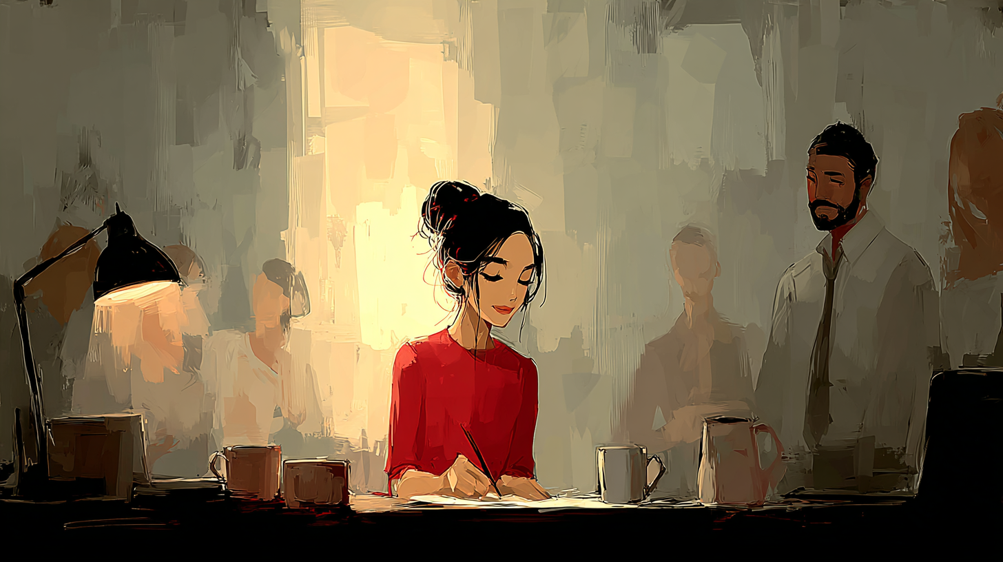
On Monday morning, our marketing team gathered in the meeting room for the weekly planning session. We had a new project: creating a short internal newsletter to improve communication across departments. Our manager, Ms. Sato, wanted it to feel friendly, not cold or formal. She said, “Numbers are important, but people remember stories. Let’s make it simple and clear.”
I was in charge of the design, and I suggested adding a cartoon to the front page. Ms. Sato raised her eyebrows. “A cartoon?” she asked. “Will that look professional?”
“It depends,” I said. “If we use a light political cartoon style, not about politics, but about office life, it can send a message quickly. Also, a cartoon character can guide readers through the main points.”
Ken from HR smiled. “That sounds fun. But we should avoid anything that feels mean.”
I agreed. “We can use satire, but gentle satire. The goal is to laugh together, not to attack someone.”
As we talked, I opened my laptop and showed a few examples. One was a comic that told a short story about teamwork. Another was a caricature of a busy worker with huge eyes and a giant coffee cup. The team laughed, but Ms. Sato pointed at the caricature and said, “This one might embarrass people. Let’s keep it respectful.”
So I took out my notebook and started a quick sketch. I drew a small scene: two coworkers carrying a big box together, with a speech bubble saying, “Thanks for the help.” It was a simple black and white drawing, easy to print.
Aya, our copywriter, leaned closer. “I like that. It’s warm. But can we make the message even clearer?”
We tried several versions. It was trial and error. In one sketch, the box looked too heavy, and the characters looked unhappy. In another, the box looked too small, and the teamwork idea disappeared. Ken suggested adding a short caption: “Give and take makes work lighter.” That line fit our company culture.
Ms. Sato nodded. “Good. That matches our values. Now, how do we connect it to the newsletter content?”
Aya said, “The first article is about sharing information between teams. We can show two people exchanging notes.”
I changed the sketch. Now one person handed a memo to another, and both smiled. The caption stayed, and I added a tiny arrow pointing to the first article. It felt like the cartoon was guiding the reader.
Then Ms. Sato said, “Can we also make a short animated cartoon for the intranet? Some staff rarely read printed pages.”
My eyes widened. “We can, but we’ll need time and tools.”
She replied, “Nothing fancy. Even a simple animation, like two frames, would work. The message is the same.”
After the meeting, I visited the design room and asked a colleague who had experience with animation. He said, “We can do a basic loop: the memo moves from one hand to the other. It’s quick.”
That afternoon, I took a photograph of our meeting room to match the background. I used it only as a reference, because the final image needed a friendly style, not strict realism. I didn’t want it to feel like a serious documentary. I wanted it to feel like a welcoming sign.
By Wednesday, we had a finished layout: a front-page cartoon, a clear headline, and short articles with simple icons. We also uploaded the tiny animated cartoon to the intranet. When the first issue was released, people started talking about it in the hallway.
One engineer said, “I usually skip newsletters, but the cartoon made me open it.”
Ken told me later, “It worked. The tone is friendly, and nobody feels targeted.”
Ms. Sato smiled at the next meeting. “Good job. The drawing is small, but the impact is big. Let’s keep using this style.”
I looked at my notebook full of sketches and thought about our process. It wasn’t perfect from the start, but with give and take, we found the right balance.
和訳
月曜日の朝、私たちのマーケティングチームは週次の計画会議のために会議室に集まりました。新しいプロジェクトは、社内のコミュニケーションを良くするための短い社内ニュースレターを作ることでした。佐藤さんは、冷たく堅い感じではなく、親しみやすい雰囲気にしたいと言いました。
私はデザイン担当で、表紙に漫画(cartoon:漫画)を入れる提案をしました。佐藤さんは少し驚いた様子でしたが、私は「職場あるあるをやさしく伝えるなら効果がある」と説明しました。さらに、登場人物(cartoon character:漫画の登場人物)が読者を案内する形にもできると言いました。
人事のケンは「楽しそうだけど、誰かを傷つけないように」と言いました。私は同意し、「風刺(satire:風刺)は使っても、やさしい風刺にする」と答えました。
私は例を見せました。物語のある漫画(comic:コミック)や、特徴を大げさにした似顔絵(caricature:誇張画)もありました。チームは笑いましたが、佐藤さんは「誇張しすぎは恥ずかしいかもしれない」と言いました。
そこで私はノートに下書き(sketch:スケッチ)を始めました。段ボールを二人で運ぶ場面を描き、白黒(black and white:白黒)のシンプルな絵にしました。印刷しやすいからです。
文章担当のアヤは「いいね。でももっと伝わりやすくできる?」と言いました。私たちはいくつも試し、試行錯誤(trial and error:試行錯誤)をしました。箱が重すぎると暗い雰囲気になり、箱が小さすぎると協力の意味が弱くなりました。ケンは「譲り合い(give and take:譲り合い)があると仕事が軽くなる」と短い言葉を提案し、会社の雰囲気に合いました。
佐藤さんはうなずき、「ニュースレターの内容とどうつなぐ?」と聞きました。アヤは「チーム間で情報を共有する話だから、メモを渡す場面がいい」と言いました。私は絵を修正し、メモを渡す場面にして、最初の記事に誘導する矢印も入れました。
さらに佐藤さんは「社内サイト用に短いアニメ(animation:アニメーション)も作れない?」と言いました。私は時間と道具が必要だと伝えましたが、同僚が「二枚程度の簡単な動きならできる」と言ってくれました。
その日の午後、背景の参考のために会議室の写真(photograph:写真)を撮りました。ただし完成品は、厳密な写実(realism:写実)ではなく、親しみやすい雰囲気にしたかったので、写真はあくまで参考です。堅い記録映像のように見せたくありませんでした。
水曜日までに、表紙の漫画(cartoon:漫画)、分かりやすい見出し、短い記事、そして社内サイトの短いアニメ付きの完成版ができました。配信すると、廊下で話題になりました。あるエンジニアは「普段は読まないけど、漫画(cartoon:漫画)がきっかけで開いた」と言いました。ケンも「誰も狙われた感じがなくて良い」と言い、佐藤さんは「小さな絵でも影響は大きい」と笑いました。
「cartoon」のQ&A
- Qcartoon はどんな意味ですか
- A
cartoon はおもしろい絵の漫画や風刺画、またはアニメ作品のことです
- Qcartoon と comic の違いは何ですか
- A
comic は物語が続く漫画全体を指しやすく、cartoon は1枚の絵や短い表現にもよく使います
- Qcartoon と animation の違いは何ですか
- A
animation は動く映像の技術や作品で、cartoon はその中でも漫画風のアニメ作品を指すことが多いです
- Qcartoon に satire が入ることはありますか
- A
ありますが、satire は笑いで批判する狙いのことで、cartoon はその絵や作品の形を表します
- Qcartoon と sketch はどう違いますか
- A
sketch は下書きや簡単な線画で、cartoon は完成した漫画風の絵や作品を指すことが多いです
- Qpolitical cartoon はどんなときに使いますか
- A
political cartoon は政治や社会の話題を絵で風刺するときに使います
- Qcartoon character は何を指しますか
- A
cartoon character は漫画やアニメに出てくる登場人物のことです
- Qdraw a cartoon は自然な言い方ですか
- A
自然で、漫画を描くという意味でよく使われます
- Qcartoon の反対っぽい表現はありますか
- A
写真のような photograph や、写実を重視する realism は cartoon と対照的な表現として使えます
コメント